
2023
The Palette
Crafting a Modern Digital Identity for a Interior Design Firm
11 to 13 mins

INFO
Product
Brand Identity for The Palette
Skills
The project demanded expertise in various areas of branding, strategy, and design to build a cohesive and high-impact brand identity. The key skills involved were:
Brand Strategy & Positioning
Luxury Branding & Visual Identity Design
Typography & Color Psychology
Marketing Collateral Design
Website Design Direction
My Contribution
Brand Designer
Duration
Team Composition
The project was executed over a 3-week intensive branding process, involving:
Our close collaboration ensured that every branding decision aligned with The Palette’s long-term business goals while maintaining its exclusivity and premium appeal.
THE BRAND CONTEXT
The Palette is a luxury interior design firm based in India, catering exclusively to high-net-worth individuals (HNWIs) and ultra-luxury clients. Unlike mass-market interior design services, The Palette deliberately positions itself as an aspirational, high-end brand, offering bespoke design solutions that are unattainable for the general market.
This commitment to luxury is reinforced through strategic partnerships with premium material providers such as Hafele, Asian Paints, and Jaquar, ensuring that every project is crafted with the finest resources available.
THE GOAL
To create a cohesive and ultra-luxury brand identity for The Palette, ensuring timeless elegance, exclusivity, and adaptability across all brand touchpoints.
DEFINING PROJECT SCOPE
THE CHALLENGE:
Establishing Brand presence
CONSTRAINTS & CONSIDERATIONS
01
Pre-registered Logo & Primary Color
The company had already registered its brand identity legally, meaning modifications to the logo and core color palette were not an option.
02
Ultra-Luxury Positioning
The identity had to feel aspirational yet exclusive, ensuring it attracted only high-value clients while maintaining a sense of unattainability for the general market.
03
Premium Material Partners
The brand's affiliations with top-tier material providers had to be seamlessly integrated into the identity, reinforcing trust and credibility.

GOAL OF THIS STEP
USER GOALS
Enhancing Brand Perception & Engagement
Seamless Brand Experience
To experience a seamless, refined brand journey across digital, print, and physical interactions, reinforcing the brand’s credibility and craftsmanship.
Instant Brand Recognition
To instantly recognize The Palette as a premier interior design firm, distinguished by its timeless elegance, bespoke approach, and high-end service quality.
BUSINESS GOALS
Establishing a Strong & Scalable Brand Identity
Ensuring Brand Consistency & Adaptability
To develop a cohesive and adaptable visual identity system, ensuring consistency across future marketing, digital platforms, and high-end client interactions.
Laying the Foundation for Future Expansion
To lay the groundwork for Phase 2 expansion, including website development, company profile creation, and premium marketing collaterals, strengthening brand recognition and business growth.
Strengthening Brand Authority in the Luxury Market
To position The Palette as an industry leader in ultra-luxury interior design, ensuring it stands out among competitors through strategic branding, premium collaborations, and strong storytelling.
Increasing High-Value Client Acquisition & Retention
To create a branding system that not only attracts high-net-worth clients but also fosters long-term relationships, reinforcing The Palette’s bespoke, client-first approach.
GOAL OF THIS STEP
Gauri Khan Designs – A Celebrity-Driven Luxury Brand
Branding Rooted in Star Power
The brand heavily leverages Gauri Khan’s personal identity and status, making the brand aspirational through association rather than standalone luxury branding.
Minimal Yet Glamorous Visual Identity
The website and branding use high-contrast monochromes, metallics, and cinematic photography, evoking sophisticated opulence.
No Distinctive Symbolism or Brand Patterns
Unlike traditional luxury brands, there is no emblem or structured brand pattern, relying instead on lifestyle-driven branding and Gauri Khan’s personal aesthetic.
What Makes It Different?
Gauri Khan Designs stands apart due to its celebrity-driven brand positioning, where the founder’s persona is the primary brand asset. This makes the brand aspirational but less scalable without celebrity association.

Hipcouch (India) – Functionality Meets Modern Aesthetics
Clean, Minimalist Branding
The brand uses a modern, approachable identity with muted pastels, sans-serif typography, and structured layouts, making it feel professional yet easy to engage with.
Tech-Driven, Process-Oriented Approach
Unlike traditional luxury firms, Hipcouch focuses on standardized processes, digital consultations, and systemized service offerings, making it feel efficient rather than artisanal.
More Commercial, Less Exclusive
The branding lacks bespoke craftsmanship appeal, instead emphasizing convenience and affordability for upscale urban dwellers.
What Makes It Different?
Unlike ultra-luxury brands, Hipcouch positions itself as an efficient, technology-backed design service, making luxury design feel structured, scalable, and process-oriented rather than custom and exclusive.

Donna Mondi Interior Design – Bold & Dramatic Luxury
Refined, Editorial Branding Approach
The branding is sleek, high-fashion inspired, and editorial-like, incorporating rich contrasts, luxurious serif typography, and cinematic photography.
Signature Use of Black, Gold, & Neutral Tones
The color palette is classic, moody, and sophisticated, ensuring the brand feels timeless yet contemporary.
Emphasizes Lifestyle Over Technicality
The branding experience focuses on storytelling, curated collections, and a highly aspirational lifestyle, rather than technical design processes.
What Makes It Different?
Donna Mondi’s branding is deeply rooted in high-fashion influences, making the brand aspirational, editorial, and exclusive, closely aligning with luxury fashion houses rather than traditional interior design firms.

Jean-Louis Deniot – Architectural Grandeur & Prestige-Driven Branding
Refined, Understated Elegance
The branding exudes classical European luxury, using soft color tones, sculptural imagery, and symmetrical layouts to reflect grandeur without excess.
Highly Symbolic & Architectural Identity
The visual identity incorporates strong geometrical elements and structured design principles, emphasizing precision and balance.
Focus on Prestige Rather Than Engagement
The brand has an exclusive, reserved online presence, designed more for prestige positioning than interactive consumer engagement.
What Makes It Different?
Jean-Louis Deniot’s branding focuses on heritage-style luxury, classical architecture, and high-status appeal, rather than digital engagement or lifestyle-driven storytelling.

Old Brand New – Eclectic, Artistic, & Retro-Inspired Branding
Vibrant, Playful, & Art-Driven Identity
Unlike most luxury brands, Old Brand New embraces bold color palettes, asymmetric layouts, and retro-modern aesthetics, making it feel artistic and unconventional.
A Personalized & Artistic Brand Voice
The brand’s personality feels handcrafted and creative, leaning towards artistry rather than polished, high-end luxury appeal.
Lifestyle-Integrated Branding
The brand focuses on personal experiences, blog-style storytelling, and a fluid creative journey, differentiating it from structured, corporate luxury branding.
What Makes It Different?
Old Brand New stands apart by blending vintage influences with contemporary art, making it playful and expressive, rather than formal, structured, or ultra-premium.

DEFINING VISION & VALUES
01
Exclusivity
“Luxury is not for everyone.”
The Palette caters strictly to high-net-worth individuals, ensuring an invitation-only feel rather than a mass-market approach.
02
Bespoke Craftsmanship
“Every design is a masterpiece, tailored to perfection.”
The brand believes in curated, tailor-made solutions rather than cookie-cutter designs.
03
Timeless Elegance
“Trends fade, but true luxury is forever.”
The Palette embraces classic, refined aesthetics that withstand time.
04
Innovation & Modern Adaptability
“Heritage meets modernity.”
While rooted in classic luxury principles, the brand integrates modern design elements and cutting-edge digital experiences.
GOAL OF THIS STEP
LUXURY MARKET & AUDIENCE
01
They seek exclusivity
Luxury is about rarity. The Palette’s brand identity had to signal “not for everyone”, making it desirable for the elite.
02
They value experience over price
Cost is not a barrier; instead, they evaluate brands based on craftsmanship, attention to detail, and prestige.
03
They expect high-touch service
The branding had to reflect a personalized, high-end experience, similar to bespoke luxury brands.
04
They resonate with storytelling
Emotional connection plays a huge role. The Palette’s brand identity had to communicate narrative of artistry & exclusivity.
01
Minimalist yet opulent aesthetics
Luxury clients prefer clean, sophisticated designs with a focus on premium materials and craftsmanship.
02
Sustainability & conscious luxury
High-end customers are shifting toward sustainable, high-quality materials that stand the test of time.
03
Personalization & exclusivity
No two luxury projects are alike; branding had to emphasize customization and craftsmanship.
04
Association with premium brands
Partnering with Hafele, Asian Paints, Jaquar, etc. was a strong credibility signal for The Palette.
COMPETITIVE INSIGHTS SYNTHESIS

High-end brands use minimalistic yet powerful branding
Their identity isn’t loud but subtle, refined, and memorable.

They leverage aspirational storytelling
Instead of selling services, they sell a lifestyle and an experience.

They build credibility through association
Featuring collaborations with premium material suppliers and iconic projects enhances trust.

They maintain brand exclusivity
These brands don’t try to cater to the mass market, reinforcing desirability.
01
Overly decorative or cluttered designs
Luxury brands use restraint and precision in their visual identity.
02
Generic stock photography & content
High-end clients expect original, high-quality visual assets.
03
Inconsistency in branding elements
Premium brands have strict guidelines to ensure a seamless experience across all platforms.
EMOTIONAL TRIGGERS
Exclusivity and Prestige
The brand identity needed to create a sense of rarity and desirability, ensuring it appealed only to a select clientele.
Sophistication and Elegance
The typography, color palette, and design elements had to feel refined, not flashy.
Timelessness and Trust
Unlike trend-driven brands, The Palette had to exude a timeless appeal, showcasing reliability and longevity.
Bespoke and Personalized
The brand voice had to communicate that every project is a masterpiece, crafted uniquely for each client.
01
Creativity & Innovation
Had to be reflected through modern yet timeless design aesthetics.
02
Quality & Craftsmanship
High-end materials, elegant typography, and premium finishes were key in brand applications.
03
Customer-Centric Approach
The identity had to feel bespoke, warm, and sophisticated, reinforcing a high-touch luxury experience.
04
Integrity & Transparency
The brand needed to convey trust and credibility through refined messaging and branding consistency.
GOAL OF THIS STEP
LOGO: REFINING ITS USE CASES

1
2
3
How the primary logo look like?

How we Expanded the Logo for Different Environments
Single Variant
Primary theme version
Dark Theme Version
Golden Theme Version
Monochrome White Version
Monochrome Black Version
Primary Theme Version
(Ivory on Primary color Background)
For primary-color heavy, clear identity, and modern applications
Dark Theme Version
(Gold on Dark Background like #202020)
For website, signage, and sophisticated print applications.
Golden Theme Version
(Green and Dark hues on Golden Background)
For Rich and metallic packaging, stationary and engravings
Monochrome Variants
(Black & White)
For watermarks, embossing, and low-color print scenarios.

GOAL OF THIS STEP
CRAFTING THE COLOR PALETTE
Luxury Green + Soft Beige
Gave a refined, warm contrast but felt too delicate for an authoritative luxury brand.
Luxury Green + Champagne Gold
Elegant and premium but lacked the richness needed for bold branding.
Luxury Green + Ivory White
Provided contrast but felt too minimal and didn’t enhance luxury appeal.
Luxury Green + Shining Gold
The perfect combination: bold, sophisticated, and unmistakably premium.

GOAL OF THIS STEP
CHOOSE RIGHT TYPEFACE
Bodoni
Classic luxury, but too dramatic for digital readability.
Garamond
Timeless and elegant, but felt too traditional.
Playfair Display
Aesthetic but lacked the gravitas needed for the brand.
Trajan Pro + Iowan Old Style
The perfect match, balancing luxury with modern readability.

GOAL OF THIS STEP
BRAND SHAPES & PATTERNS
How the emblem look like?

How the emblem look like?


Website & Digital Media
Used as background elements to create layered depth without overwhelming the content.

Print Materials & Brochures
Integrated as subtle dividers, overlays, and frame accents to enhance the premium feel.

Luxury Packaging & Signage
Applied in gold foil stamping and engraving techniques to create a tactile sense of exclusivity.

Business Cards & Stationery
Used as delicate background accents to reinforce branding without overpowering readability.
GOAL OF THIS STEP
Minimal, high-end aesthetics
A design approach that is spacious, editorial, and immersive, allowing high-resolution project imagery to take center stage.
Subtle animations and interactions
Creating a fluid, refined user experience that feels premium without being excessive.
A focus on storytelling
Sections going beyond services, highlighting The Palette’s philosophy, bespoke design approach, & client experiences.
Trust-building elements
Featuring brand collaborations (Hafele, Asian Paints, Jaquar), case studies, and client testimonials to reinforce credibility.
Luxury-standard navigation & interactions
Prioritizing seamless browsing, intuitive contact points, and a refined consultation booking experience.
High-end print finishes
Featuring gold foil stamping, embossed textures, and premium-quality paper to create a tactile luxury experience.
Structured, minimal layouts
An editorial-style composition, using ample white space and strong visual hierarchy.
Visual storytelling over text-heavy content
Prioritizing large, stunning project images and minimalistic, impactful typography.
Integration of The Palette’s brand patterns
Using the emblem and sleeping petal shapes subtly throughout the document to reinforce the brand identity.

Business Cards
Final Business Card Design Features:
Design Impact:
The final design ensures that every interaction with The Palette’s business card leaves a lasting impression, setting the tone for a premium, high-value relationship with the brand.
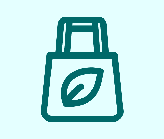
Luxury Tote bags
Tote Bag Design Elements:
Design Impact:
Whether used for client gifting, premium material samples, or showroom branding, the tote bag reinforces The Palette’s luxury experience beyond just interior spaces.

Favicon & App Icon
Favicon Variations:
App Icon Concept:

Outdoor Advertising Assets
Billboards & Hoardings:
Storefront & Signage Concept:
Design Impact:
Whether used for client gifting, premium material samples, or showroom branding, the tote bag reinforces The Palette’s luxury experience beyond just interior spaces.


GOAL OF THIS STEP
01
Offline Habits, Online Expectations
The issue
When the project began, The Palette already had a registered logo and primary color (Luxury Green). This posed a creative limitation, as we had to work within existing constraints while developing a refined, adaptable identity system.
The logo was also available only in a single version, making it difficult to use across various backgrounds and applications.
Strategic Decision & Solution
1.1
Expanded the logo variations
Created light, dark theme versions to ensure seamless adaptability across digital and print mediums.
1.2
Developed a structured logo usage system
Introduced monochrome and emblem-based alternatives for flexibility in luxury packaging, signage, and digital branding.
1.3
Ensured logo consistency
Set clear spacing, color contrast, and background usage guidelines to prevent misrepresentation.
Key Learnings
Luxury branding requires flexibility
A single-logo approach limits brand versatility, so defining logo variations for different environments was a crucial step.
02
Overcoming the Lack of an Established Brand Narrative
The issue
While The Palette had a pre-registered name and logo, it lacked a compelling brand story that communicated why it existed, what made it unique, and how it was different from competitors.
Without a strong brand narrative, it risked being perceived as just another interior design firm rather than an elite, invitation-only design house.
Strategic Decision & Solution
2.1
Created an exclusive brand persona
We positioned The Palette as a highly curated, invitation-only service provider, reinforcing the idea that not everyone could access it.
2.2
Defined a luxury-driven storytelling approach
Instead of focusing on services, we built a brand language around “tailored artistry” and “designing a legacy,” making the firm feel aspirational, timeless, and irreplaceable.
2.3
Wove this narrative into branding materials
Every touchpoint (from website copy to business cards) emphasized exclusivity and sophistication, ensuring the brand felt desirable rather than just available.
Key Learnings
Luxury brands are built on storytelling, not just visuals—the strongest brands create a world that clients aspire to be a part of.
03
Balancing Luxury Exclusivity with Digital Accessibility
The issue
Luxury brands thrive on personal connections and high-touch experiences, but digital branding requires accessibility and engagement. The Palette needed to be present online but not feel too accessible, as overexposure could dilute its exclusivity.
Strategic Decision & Solution
3.1
Designed a highly curated digital presence
Instead of traditional commercial website layouts, we planned an experience that felt like a private design gallery, emphasizing minimal yet immersive interactions.
3.2
Restricted accessibility while maintaining engagement
Key sections of the website (like pricing and project inquiries) were structured to feel highly personalized and consultation-driven, reinforcing client selectivity.
3.3
Focused on digital storytelling rather than mass-market appeal
The brand’s digital assets were crafted to invite engagement from the right audience while deterring those seeking budget or mass-market services.
Key Learnings
A luxury brand should be present online but never feel overexposed—digital touchpoints should feel like an exclusive invitation, not an open-door business.
04
Making the Brand Visually Distinct in an Overcrowded Market
The issue
The luxury interior design space is crowded with brands using similar muted color schemes, serif fonts, and high-end photography. To ensure The Palette stood out, we had to create a recognizable identity that felt different but still luxury-compliant.
Strategic Decision & Solution
4.1
Developed a unique emblem-based identity system
Instead of just using a typographic logo, the brand embraced a symbol that could act as a luxury identifier across physical and digital assets.
4.2
Crafted proprietary brand patterns
We used the emblem and “Sleeping Petal” shapes to create a signature visual motif, ensuring every branded asset had a distinctive touch of elegance.
4.3
Introduced a deeper contrast in color pairings
Many competitors relied on safe beige tones, so The Palette embraced a bold Luxury Green and deep gold contrast, making it more memorable.
Key Learnings
Luxury brands must feel both familiar and uniquely ownable—design systems should include signature elements that clients instantly recognize.
Phase 2: Pre-Defined Next Steps

Website Development
What's going to be cooked here:
Translating the luxury identity into a high-end digital experience, including immersive storytelling, interactive elements, and seamless client engagement features.

Company Profile Design
What's going to be cooked here:
Crafting an editorial-style brand book that presents The Palette’s vision, craftsmanship, and project expertise in a premium format.

Marketing Collaterals
What's going to be cooked here:
Developing key assets such as brochures, pitch decks, presentation templates, and digital media kits, ensuring consistency across print and online platforms.
ADDITIONAL OPPORTUNITIES FOR GROWTH

Exclusive Printed & Digital Publications
Luxury Coffee Table Book – A high-end publication featuring The Palette’s finest projects, material inspirations, and industry thought leadership.
Bespoke Client Design Guides – Exclusive printed/digital handbooks offering insights into luxury materials, space planning, and interior styling tips.

Personalised Client Experience Enhancements
VIP Welcome Kits – A high-touch experience for premium clients, including personalized thank-you notes, curated material samples, and luxury stationery.
Private Consultation Invitations – High-end, custom invitations for exclusive one-on-one design experiences, reinforcing the brand’s ultra-luxury positioning.

Packaging & Product Branding Extensions
Signature Packaging for Design Materials – Custom-designed packaging for luxury interior samples, swatches, and catalogs, enhancing brand perception.
Co-Branded Luxury Product Line – A potential collaboration with high-end furniture and décor brands to create branded interior accessories.

Strategic Event & Community Branding
Industry Collaborations & Sponsorships – Partnering with architectural, design, and lifestyle events to establish The Palette as a thought leader in luxury interiors.
Exclusive Design Workshops & Masterclasses – Offering invite-only experiences for elite clients and designers, reinforcing the brand’s expertise.

AI & Digital Experience Innovations
AI-Driven Virtual Consultation Tool – A potential digital experience where clients can get personalized interior recommendations based on their preferences.
Augmented Reality (AR) Previews – Allowing clients to visualize interior designs in their own spaces before finalizing selections.

VOLTED PC
From Offline Shelves to Online Carts: Volted PC’s Digital Shift
Why Should You Check This Out?
See how a legacy offline tech retailer was transformed into a modern, conversion-ready e-commerce experience—designed to scale, built to sell.
Estimated Reading time : 14-15 mins

CONSTRUCTION GRAB
Building a Seamless Platform for Construction Materials
Why Should You Check This Out?
See how smart UX simplified a chaotic industry. A deep dive into building a marketplace for construction materials.
Estimated Reading time : 11–13 mins