


2024- 2025
QDAP
Designing a frictionless enterprise SaaS solution to simplify secure data onboarding, quality, and orchestration for GenAI, ML & other workloads.
20 to 25 mins
INFO
Product
Quantiphi's Data Acceleration Platform in Quantiphi's GTM Portfolio
Skills
Enterprise UX Strategy
Information Architecture
UI Design for SaaS
Workflow Mapping
Data Visualization
Prototyping
Cross-functional Collaboration
My Contribution
I worked as the lead designer on this platform alongside Quantiphi’s product and data engineering teams. My focus was to:
My focus was to:
Design scalable flows across complex, multi-role personas
Translate technical data processes into intuitive UX
Maintain clarity, trust, and no-code flexibility without overwhelming users
Ensure enterprise-grade usability across onboarding, transformation, and governance journeys
Duration
PROBLEM STATEMENT
In the race to adopt GenAI at scale, enterprises are running into a familiar bottleneck — data readiness. From access and ingestion to governance and quality checks, over 60% of AI project time is still spent preparing data.
A AWS-based solution that reduces setup time, enables secure data sharing, and establishes governance controls out-of-the-box — helping both technical and non-technical teams move from raw data → usable data → ML-ready pipelines in record time.
THE GOAL
To introduce QDAP (Quantiphi's Data Acceleration Platform) as an enterprise-ready data acceleration platform as a part of Quantiphi's GTM initiatives, designed to simplify, fast-track and standardise the entire journey of making enterprise data ready for consumption.
HIGH-LEVEL IMPACTS
Reduced onboarding time by 60%
Enabled rapid MVPs for use cases like:
GenAI sentiment analysis
Candidate search
Code quality analysis
While respecting internal confidentiality, this case study focuses on the thought process, strategy, and product design decisions that shaped the QDAP platform — a complex B2B SaaS solution aimed at enabling GenAI readiness through enterprise-grade data orchestration.
Note: Due to NDA constraints, direct product screenshots and proprietary architecture details have been abstracted or omitted. Instead, this case study highlights the approach, problem-solving depth, and strategic UX thinking that informed the final solution.
What You’ll Learn by the End
How I approach complex, technical problem spaces
How user journeys and role hierarchies were designed in a multi-persona B2B platform
The ability to collaborate across product, engineering, and compliance
A grounded example of how design contributed to measurable business impact in an enterprise GenAI environment
USER GOALS
Accelerate Data Onboarding
Improve Usability Across Roles
Provide intuitive, role-specific experiences for data engineers, business analysts, and governance teams.
Simplify Complex Workflows
Turn multi-step pipeline orchestration, validation, and access control into clear, no-code journeys.
Establish Data Trust & Visibility
Help users understand lineage, compliance, and quality through built-in visualization and smart UI cues.
BUSINESS GOALS
Reduce GenAI Time-to-Value
Standardize Reusable Data Practices
Build a replicable foundation for future enterprise clients with reusable pipelines, templates, and policies.
Drive Productization at Scale
Turn internal frameworks into an external-facing, license-ready SaaS accelerator for enterprise adoption.
Ensure Governance & Compliance
Build trust by embedding security, traceability, and permission control into every part of the data lifecycle.
KEY HIGHLIGHT 1
No-Code, Self-Service Data Pipeline Builder
A visually intuitive pipeline orchestration tool that allows users to build and modify complex data flows using drag-and-drop elements — without writing a single line of code.
WHY IT MATTERS?
Data engineers and analysts can ingest, transform, validate, and govern data faster and more reliably — reducing setup time and dependency on dev-heavy workflows.
IMPACT
Reduced data pipeline setup time by 60%
Enabled cross-role adoption (not just for technical users)
Accelerated ML/GenAI readiness from weeks to days
KEY HIGHLIGHT 2
Built-In Governance & Role-Based Access Controls
Every pipeline, dataset, and transformation is embedded with role-aware security and data access policies, leveraging AWS Lake Formation and custom permission layers.
WHY IT MATTERS?
In enterprise environments, data compliance isn’t optional. QDAP ensures every action is traceable, controlled, and auditable — without compromising usability.
IMPACT
Enabled enterprise-grade security from Day 1
Simplified governance for non-technical users
Improved platform trust for decision-makers and compliance teams
Our vision for QDAP is to empower organizations to unlock the true potential of their data — faster, safer, and smarter
In an era where GenAI success depends on data readiness, QDAP brings structure to chaos by offering a reusable, secure, and scalable foundation that works across industries, teams, and cloud architectures.
Whether you're a global enterprise or a fast-scaling disruptor, our goal is to help you move from raw data to real intelligence — in weeks, not months.
Practice Lead, AWS Unit, Quantiphi
Designing for a complex enterprise data platform like QDAP meant going beyond traditional screen-level problem-solving.
This was a journey that demanded deep alignment with engineering logic, AWS architecture, governance structures, and real user behavior.
Here’s the overview how the UX approach evolved in parallel with product development:
OVERVIEW
Before diving into any interface, logic, or modules, we needed a 360° understanding of the business problem, technical landscape, and product vision.
This was especially critical because QDAP was intended to be a scalable, reusable, cross-industry solution — not just a one-off tool.
To get that clarity, we conducted 2–3 structured discovery workshops involving core stakeholders from:
AWS Practice Leads
Global Unit Heads
Sr. Data Architects
Security & Governance SMEs
Sr. Developers and Product Owners
Each workshop had a specific focus — from scoping the vision, to identifying role-specific needs, to aligning technical possibilities with product intent.
PURPOSE OF THE WORKSHOPS
Uncover the root problem areas beyond surface-level technical needs
Align all stakeholders on the target personas, use cases, and success definitions
Understand must-have constraints — compliance, security, cloud infra
Create a shared mental model around what QDAP is (and is not)
Identify blind spots and leverage opportunities from internal IP and AWS features
To establish a unified understanding of the product vision, success criteria, long-term scalability, and business alignment.
Note: Inputs and sensitive discussions in workshop boards have been intentionally blurred to respect internal confidentiality and NDA protocols.
Workshop 2: Role-Specific Needs & Personas
To define the key personas using QDAP, understand their daily workflows, responsibilities, pain points, and determine what each role needs from the platform to be effective and adopt it confidently.

Note: Inputs and sensitive discussions in workshop boards have been intentionally blurred to respect internal confidentiality and NDA protocols.
OBJECTIVE
OVERVIEW
While QDAP was intended to be a customizable product built by Quantiphi, it would operate entirely within the AWS ecosystem. That meant the design could either:
Reinvent workflows already well-supported by AWS, or
Smartly mirror what worked in AWS-native tools, and improve UX around them.
To avoid building against the grain of cloud infrastructure, we initiated a joint workshop with AWS solution architects and senior Quantiphi stakeholders, including product leads, cloud engineers, and security specialists.
01
Module Mapping with AWS Glue Studio
Explored how AWS Glue’s visual workflow orchestration could align with the desired drag-and-drop and node-based logic builder within QDAP.
Discussed adapting the idea of Glue’s job-level abstraction, enabling QDAP to separate module-level logic and configurations effectively.
Inspired the design of Data Flow Pipelines that allow users to chain modules and steps based on logic.
02
Data Lake Permissions via Lake Formation
AWS Lake Formation’s role-based access and granular column-level control was used to envision how permission abstraction in QDAP could support both security and adaptability across client-specific deployments.
Helped define user permission levels in the QDAP platform, setting the groundwork for enterprise-grade governance.
03
Integrating Data Sources & Metadata Layer
Reviewed compatibility with key data systems like Redshift, Snowflake, S3, and Athena, which directly influenced what connectors QDAP would prioritize.
Metadata tagging and lineage tracking using AWS-native services became an inspiration for QDAP’s metadata catalog.
04
Scaling Compute Resources with EMR / Lambda
EMR and Lambda were discussed to assess runtime options for workloads with varying degrees of complexity.
Helped differentiate between modules that required serverless, event-driven execution (Lambda) vs. batch and spark-based workflows (EMR/Glue).
05
Data Security & DevOps Compatibility
AWS KMS and Secrets Manager were explored for key management and credential abstraction.
The DevOps team discussed Terraform and CloudFormation templates for deployment automation, which helped shape how QDAP would be provisioned in enterprise environments.

01
Architecture Alignment:
Major components of QDAP would be structurally mapped against AWS-native services, ensuring long-term technical viability and speed of deployment.
02
Glue Studio as a Model:
The logic orchestration interface in AWS Glue Studio would be a key reference for QDAP’s visual module builder.
03
Security Backbone:
Lake Formation will serve as inspiration a solid, role-based access strategy that would be essential for enterprise data trust.
04
Connector Prioritization:
Gave a clear direction on which connectors to build first, based on compatibility and customer demand.
This collaborative workshop acted as the turning point in solidifying QDAP’s technical foundation, giving the design and engineering teams confidence that the solution wasn’t just desirable, but also technically feasible and AWS-native scalable.
OBJECTIVE
OVERVIEW
Following the AWS feasibility workshop, it became crucial to translate what was technically possible into something usable, scalable, and intuitive. While AWS Glue was to be a key enabler behind QDAP’s orchestration logic, its out-of-the-box experience was not meant for end-users in its raw form.
To avoid abstracting blindly or building disconnected UI, we conducted a set of focused collaboration sessions with Quantiphi’s DevOps and Engineering teams — specifically to:
Understand how AWS Glue works under the hood
Identify which parts of Glue could inspire QDAP modules
Clarify where UX would need to simplify, and where we needed to respect the underlying architecture

Glue Job lifecycle

Logic Builder for pipeline orchestration

Crawlers & schema mapping

Data Catalog module with schema tracking

Trigger-based jobs

Visual trigger configurator (time/event/manual)

IAM roles & config

Role-aware permission abstractions

Logs & observability

Audit view with retry history, job logs
Rather than designing in isolation, this phase helped me translate backend truth into UI clarity — respecting system constraints while shaping intuitive workflows.
OBJECTIVE
OVERVIEW
Before deciding what to build and how to build it, we needed to deeply understand who we were building for. QDAP was never meant to be a one-size-fits-all tool — it was envisioned as a modular platform serving multiple personas, each with their own roles, responsibilities, and pain points.
This step laid the foundation for:
Structuring access by role
Prioritizing module-level feature sets
Defining clear, outcome-driven user journeys
The insights from these discussions were mapped into clearly defined personas, which in turn influenced QDAP’s architecture, interface abstractions, and access logic.
These personas informed module scoping and access abstraction strategies (e.g., different views for platform owners vs. consumers).
The team validated persona needs through 4+ stakeholder interviews per role, ensuring functional decisions aligned with real-world daily pain.
Flexibility is built-in for future personas (e.g., Governance Officer, Data Steward), ensuring QDAP can adapt across industries and clients.
Persona Mapping
Identifying who we’re designing for — and what truly matters to them.
OBJECTIVE
WHY THIS STEP MATTERED?
With a complex, multi-user B2B product like QDAP, jumping straight into persona-based flows would have created inconsistencies in logic, architecture, and data ownership. Instead, we grounded the solution in a “Golden Copy” — a full-capability reference design that includes all modules, logic flows, and configurations across the lifecycle of enterprise data.
This Golden Copy became the core scaffolding upon which abstraction, customization, and scalability were layered.
DATA LIFECYCLE
We structured the solution around the natural flow of data in modern GenAI and analytical environments:

STRATEGISING ON GOLDEN COPY
What Is the Golden Copy?
The Golden Copy is not a persona’s experience — it’s the complete, unrestricted interface exposing:
All modules
All features
Full visibility
Unabstracted workflows
This version of the product was first validated with senior architects and engineers to ensure feasibility across:
AWS service integration (Glue, Lake Formation, DynamoDB, S3)
Data governance alignment
Reuse-first infrastructure
Granular Feature Mapping – The Golden Copy, Raw & Unfiltered
Before tailoring QDAP to specific user roles or use cases, we needed to map every possible module, sub-section, and key feature into a single, full-view Golden Copy.
This helped ensure our foundation was comprehensive, scalable, and built for future abstraction.
The features within each module were not imagined in isolation.
They were distilled from stakeholder discussions, AWS platform analysis (especially AWS Glue and LakeFormation), and real-world architecture and engineering collaboration.
Every feature that made it to this Golden Copy reflects a validated need — whether technical, experiential, or operational.

ABSTRACTION STRATEGY
The Golden Copy, while comprehensive, wasn’t practical for all personas.
Data engineers needed deep control over pipelines. Business analysts required clean, curated outputs. Platform engineers required visibility into governance. Admins needed oversight and user control.
This required designing a multi-tiered abstraction model that allowed:
Module-level access control
Subsection or tab-based visibility
Role-restricted edit vs. view vs. hidden actions
Predefined defaults and templates to reduce cognitive load
How the Abstraction Works
Each persona was mapped to the modules based on:
01
Visibility layer
Which modules are visible at all to the user
02
Interaction Type layer
Whether the user can view, edit, or configure features
03
Control Scope layer
How much autonomy they have within the module (e.g., full config vs. read-only)
04
Support Aids layer
Hints, templates, tooltips, or limited paths based on role complexity
This was all governed through role metadata handled via the User Management & Access Management modules, ensuring secure and flexible control.

Design Implications
Reduced overload for non-technical users (Analysts)
Prevented accidental misconfigurations via permission scoping
Empowered engineers with full toolsets without stepping on each other’s roles
Ensured a secure-by-default posture with least-privilege defaults
Modular UI components allowed dynamic hiding, disabling, or simplifying elements based on role
Instead of redesigning separate interfaces, we designed a smart, role-aware system that dynamically adapts the interface based on the user persona — offering just the right level of control, clarity, and confidence.
CRAFTING WORKFLOWS
Once the Golden Copy was defined — with its complete set of modules, sub-sections, and validated features — our next step was to translate function into experience.
Rather than jumping into screen visuals, we adopted a bottom-up design methodology, inspired by the Atomic Design approach
Designing from features upward: Sketching, Structuring, and Strategizing Interactions
This approach ensured that every screen was not just aesthetically aligned, but grounded in purpose, hierarchy, and clarity.
Our Process for Flow Crafting
01
List all must-have features per module (from the Golden Copy)
02
Convert features into interface components (via sketching layouts)
03
Validate logical user progression across screens
04
Assemble atomic units into real workflow sketches
05
Test flow structure with internal SMEs before hi-fi transition
This process was followed for every module, but in this case study, we deep dive into the 3 most functionally rich and workflow-intense ones:
Final Note on Process Reuse
Shown below on scroll are 3 SELECTED WORKFLOWS of Data Sharing, Data Profile & Quality, Visual ETL ( Data Transformation)
While only these 3 workflows are shown here, the same structured approach — starting from features, sketching atoms → molecules → flows — was used for:
SQL Workbench
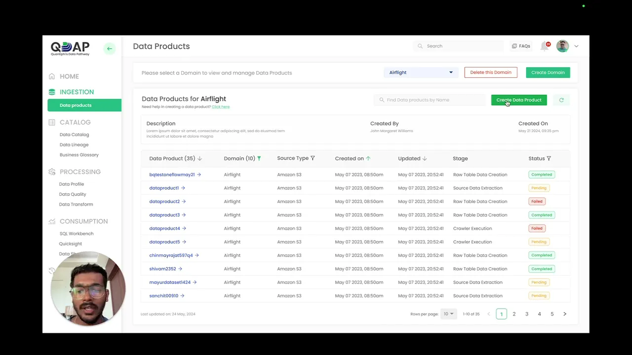
Data Products
Access Management
User Management
Data Governance
By aligning interface logic with user expectations and backend capabilities from the start, we ensured that every workflow was both usable and technically sound.
Visual ETL ( Data Transformation) Workflow
Goal:
Identifying who we’re designing for — and what truly matters to them.
From Golden Copy Features:
Drag-and-drop canvas with node blocks
Config panel for each node (Source, Join, Filter, Union, Target)
Flow validation + job run
View history of pipeline runs with statuses
Config panel for each node (Source, Join, Filter, Union, Target etc)
Clear indicators on Job and Node join completions

The job logic structure mirrored AWS Glue’s visual paradigm, but with a far simpler experience layer — aligned with feedback from data engineers and Glue architects.
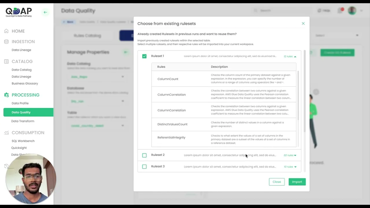
Data Profile and Quality Workflow
Goal:
Allow users to analyze data structure and health, then define rule-based validations for ongoing checks
From Golden Copy Features:
Pre-defined Rulesets to choose from
Rule grouping into reusable sets
Confidence scores to help users know how usable the generated Ruleset is
Column-wise stat display (Null %, Min/Max, etc.)
Execution history for ruleset runs
Rule builder with types (Regex, Null Check, Thresholds) to have the most granular control of the data
Clear indicators on Job and Node join completions

Rules were not designed in isolation; the flow ensured the user always had data context while writing validations — a key insight from earlier interviews.
Data Sharing workflow
Goal:
Enable secure, permissioned sharing of datasets (S3, Table, Column-level) with controlled visibility and status tracking.
From Golden Copy Features:
Expiry-based sharing
Grant-level receiver control
Conditional inputs based on sharing type (S3/Table)
Sharing status dashboard

Features were used as functional checkpoints to define when users would move between stages, and what validations were needed.
OVERVIEW
An iterative, structured, and repeatable process for designing scalable modules in QDAP
While each module had its unique workflows, the design process followed a modular framework — ensuring consistency, feature completeness, and cross-functional alignment.
This framework was applied across all modules, and in this case study, we walk through its execution across Data Sharing, Data Profile + Quality, and Visual ETL.
Each sub-step (6.1 to 6.8) represents a loop in our modular design pipeline. The arrows show evolution; the outputs of each step became the foundation for the next.

OBJECTIVE
OVERVIEW
While the Golden Copy gave us a validated library of platform-wide features, we knew that each module had context-specific use cases, edge conditions, and user frustrations that couldn’t be guessed or assumed.
This step involved sitting down with:
Data engineers
Data analysts
Platform architects
DevOps and ETL pipeline owners
… to learn how they would actually use these modules in their day-to-day workflows.
Instead of revalidating the Golden Copy, the goal was to dig deeper into:
What’s missing?
What’s hard to do today?
What do you wish this module could simplify for you?
What would reduce dependency on another team?
These interviews uncovered nuances that wouldn’t surface in generic product discovery workshops, because they were module-specific, operational, and pain-driven.
For This Case Study
In the interest of time and clarity, we showcase this process for 3 functionally rich modules:
Data Sharing
Data Profile & Quality
Visual ETL
However, the same method was followed for all other modules in the QDAP platform.
INTERVIEW APPROACH

Interviews were semi-structured, focused on each module’s role in the user’s data lifecycle.

Participants were shown a simplified version of the Golden Copy’s features and asked:
“Does this cover everything you need? What’s not here?”

The responses were recorded in an audio format, to later go back and reference when synthesizing the data points

We used contextual triggers (sample datasets, use case examples) to prompt deeper feedback.
NEW FEATURE DISCOVERIES
These are real examples of functionality that emerged only after speaking to practitioners:
Visual ETL
Option to delete nodes from the interface in bulk
Bucket Nodes into SOURCE, TRANSFORM and TARGET for easy access
Indicate warnings or errors in Individual nodes even before Running the job
Data Profile & Quality
Data Profile and Data Quality became two different modules as opposed to the single merged module in Golden copy. The Data Quality was then divided into 2 major views: Rules Catalog and Data Quality
Rules catalog of the solution available all the time to onboard and structure rules easily
Option to import Rulesets from offline CSV or XLS files
Properties panel always available to switch between Data products and Databases at any given point of time
Insert System generated Data Quality Recommendations, to avoid time and effort in creating Rules from scratch
Impact of this step
OBJECTIVE
OVERVIEW & CONTINUITY
Following our detailed insight gathering in Step 6.1, we transitioned into a focused design development loop — involving internal translation, validation, and iteration — before diving into high-fidelity visual design.
These next steps (6.2 to 6.5) were intensely productive but deliberately internal-facing.
They involved deep thinking, collaborative sketching, and repeated validation, but to keep this story sharp and purposeful, we’ve chosen to summarize these phases rather than elongate them with unnecessary detail or filler — without losing the clarity of what happened or why.
BEHIND THE SCENES
01
6.2 – Feature-to-Component Translation:
We broke each insight down into tangible UI patterns — from data rule blocks to grant revocation modals — using atomic design principles to define modular, reusable building blocks.
02
6.3 – Workflow Restructuring:
We updated each previously defined module flow to integrate the new components and logic points, ensuring usability and logic alignment at every step.
03
6.4 – Mid-Fidelity Wireframes + Testing:
Components were assembled into wireframes and tested again with our ground users. These tests helped validate clarity, coverage, and interaction flow without visual styling bias.
04
6.5 – Wireframe Iteration:
Feedback was actioned quickly — from unclear button states to confusing terminologies — ensuring the structure was tight and ready for its visual identity.
Why These Steps Mattered
They allowed us to design from the inside-out, not screen-down
They validated our logic before investing in polish
They prepared the structure for scale and reuse
And most importantly, they gave us a clean handoff point into the visual identity system in Step 6.6
“These four steps were about thinking, refining, and validating — quietly but critically. They set the stage for everything that followed in our visual design journey.”
Up Next: Step 6.6
We now move into the Visual Language & Component System, where everything begins to take shape — beautifully, consistently, and systemically.
QDAP Style Guide

QDAP Component Library
OBJECTIVE
WHY THIS STEP WAS CRUCIAL
The platform’s success hinged on its usability and credibility. This required a design system that:
Could scale across modules and persona views without feeling inconsistent
Was familiar and on-brand for Quantiphi’s internal stakeholders
Felt approachable for analysts and power users alike
Delivered a sense of enterprise-grade polish and clarity
What we created wasn’t just UI polish. It was a system of components, colors, and affordances that reduced ambiguity, sped up development, and made the product feel cohesive from login to logout.
Style Guide System – Key Pillars
Color System (As seen in Graphic 1 Above)
We started with the 3 primary brand colors of Quantiphi:
Primary Green
Deep Blue
Charcoal Black
These were expanded into 18+ purpose-driven shades for:
Background states (filled, hover, selected)
Tags and status badges (success, info, warning, error)
Button and icon states (active, disabled, outline)
Alert zones (dangerous operations, blockers)
Dashboard highlights (running jobs, quality scores)
Design Choice Rationale:
We deliberately extended the green spectrum to symbolize transformation, trust, and continuity — key pillars of the data lifecycle. Accent colors for statuses added information clarity without overwhelming visual noise.
Typography
Clear and compact, we used:
Headers with hierarchical visual weights (24pt, 22pt, 19pt)
Body and caption sizes optimized for data-dense screens
Readability-first type pairing to balance technicality with openness
Spacing and text grids were tuned for 1920px+ dashboards as well as responsive views — ensuring scalability without layout distortion.
Spacing System
Built on an 8px base grid, with modular spacing rules for:
Table row padding
Form sections
Modal dialogs
Button clusters and callout spacing
The goal was to prevent layout fatigue in multi-step tasks, like creating grants or configuring ETL jobs.
Component System – UI at Scale (As seen in Screenshot 2)
Core UI Elements:
We created a centralized component library organized by usage and reusability:
01
Buttons (primary, secondary, destructive)
PURPOSE
Task flow progression + inline action
02
Input fields (search, form, select)
PURPOSE
Data input and filtering
03
Tags & badges
PURPOSE
Quality score labels, access levels, statuses
04
Table patterns
PURPOSE
Paginated data views, sort/filter actions
05
Cards & modals
PURPOSE
Data summaries and contextual dialogs
06
Progress indicators
PURPOSE
Used across workflows and rule runners
Each component had:
✅ States (default, hover, active, error, disabled)
✅ Size variants (compact, standard, expanded)
✅ Role-based usage rules (e.g., visible/editable only for engineers or admins)
Illustration & Iconography
To keep the platform warm and human, we infused subtle, strategic illustrations in:
Empty states
Onboarding views
Persona-specific dashboards
Error + success screens
These illustrations were chosen to reinforce familiarity without making the interface feel cartoonish.
Used purposefully to reduce friction in complex flows, and to make new users feel supported in high-complexity operations.
Outcome
01
A robust design system fully aligned with development
02
A Figma-first single source of truth
03
Faster screen-level assembly through component reuse
04
A visual experience that bridged logic with clarity & branding with usability
“Instead of designing page by page, we built a system that could generate consistent, intuitive pages — no matter who the user was, or which module they were in.”
OBJECTIVE
To showcase the end-state of the designed solution — not screen by screen, but as a connected system — through a quick walkthrough that reveals how users, regardless of role or technical expertise, move through the platform with confidence, clarity, and purpose.
Common Design Practices Followed Throughout
01
Progressive Disclosure in UI
Rather than overwhelming users, the interface is structured to reveal complexity only when needed.
Collapsible sections
Lazy-loaded rule groups
Hover-on details for advanced controls
This kept the experience clean, especially for new or non-technical users.
02
Action-Centered Design with Guardrails
Every action that impacts data or configurations is protected by:
Contextual modals with descriptions
Confirmation prompts with consequences
Warning toasts and non-blocking validations
This helped build trust and reduce human error across multi-step actions like revoking access, running pipelines, or saving rules.
03
Consistent Interaction Layouts
Whether it’s Profile, Quality, Sharing, or ETL:
Top-level navigation is consistent
Left-column module identity, right-side action zones
Primary CTAs placed right-aligned for flow completion
This gave users a sense of spatial orientation, no matter which module they were in.
04
Feedback-First Components
Most components provide immediate visual feedback:
Status chips
Inline validations
Hover indicators and tooltips
The goal was to never leave the user wondering “Did it work?” or “What happens next?”
OBJECTIVE
WHY THIS STEP WAS CRUCIAL
In enterprise product environments like QDAP, design is not complete when the Figma files are. True delivery happens when the experience is built, behaves as expected, and works for real users in real environments.
To ensure that:
Modules were not just “shipped” but were experience-complete
Devs could work in parallel without waiting for the entire product to be designed
Feedback was tracked, tested, and resolved within clear cycles
We followed a tight, staged loop of handoff, testing, and iteration.
The Feedback + Fixing Cycle

Design → Dev Handoff
Annotated flows and interactive prototypes were shared
Dev walkthroughs were conducted via sync call.
Dev team started parallel engineering builds

Dev → Design QA Loop
Once dev completed a module, it came back to design for review
I tested against the intended Figma — interaction by interaction, pixel by pixel
Every mismatch, inconsistency, or logic gap was listed into a shared tracker

Tracker-Based Collaboration
The tracker included:
Component misalignments
Incorrect paddings/spacing
Interaction bugs
Missing validation logic
Unstyled or placeholder elements
Each issue was prioritized, labeled, and tracked to closure
Devs worked in sprints to address feedback in batches

Final QA & Sign-off
Once all flags were cleared, the module was signed off
Documentation updated for consistent scaling and client-specific adaptation
Dev team started parallel engineering builds
Supporting Media
The design QA tracker, highlighting how issues were logged, resolved, and mapped to dev progress has been attached on scroll next.
Outcome
01
A repeatable design→dev→QA loop that ensured pixel-perfect parity
02
Minimal rollout bugs due to early issue capture
03
Faster design velocity due to staggered delivery (no waiting on full product lock)
04
High team confidence — designers, devs, and QA were in sync every week
“It wasn’t just about building what was designed. It was about building it with intent, consistency, and zero surprises — module after module.”

OBJECTIVE
OVERVIEW
At this stage, the core design contribution was mostly complete. Each module had:
Passed design QA
Been functionally validated by Dev and QA teams
Been built in alignment with Figma handoffs and design tokens
The remaining focus was on:
Regression testing and bug sweeps
Deployment workflows to staging → production
And from the design side: final integrity checks before production push
Design’s Role in the Final QA Loop
Although the QA team and engineers handled the majority of test cases and validation, design stayed involved in:
01
Pre-Production Design Review
Rather than overwhelming users, the interface is structured to reveal complexity only when needed.
Spot-checking edge cases in staging builds
Reviewing data visualizations, modals, and permission flows
Ensuring no visual drift had occurred from dev fixes or QA patches
Checking responsive layout consistency across browser resolutions
“This wasn’t full design QA — it was surgical, last-mile checks to ensure design standards didn’t erode under delivery pressure.”
02
Partnering with QA on UI/UX spaces
While QA focused on functionality and performance:
Design audited UI , component misplacements, spacing bugs, and typography alignment.
Helped QA differentiate between dev bugs vs. design regressions.
We used the same shared issue tracker from earlier steps to close final design issues — usually minor, but essential for polish.
Step 8: Rollout & Production Sync
Although the QA team and engineers handled the majority of test cases and validation, design stayed involved in:
Once QA and design testing passed:
The module was tagged for release approval
DevOps ran integration checks to verify no downstream dependency breakage
The build was promoted to production in alignment with the engineering schedule
In parallel:
Admin dashboards were reviewed
Final SSO integrations were confirmed
Permissions were sandbox-tested by internal users

“Just because design shipped early didn’t mean we stopped showing up. We stayed until the product met the promise.”
Outcome
01
Every module was shipped with design alignment preserved
02
No last-minute overrides, inconsistent styling, or layout regressions
03
Handed off with a strong design testing DNA embedded into the QA loop
OBJECTIVE
WHY THIS SECTION EXISTS
In a fast-paced enterprise initiative like QDAP, not everything is perfectly defined on Day 1. New user patterns emerge. Business intent refines. Technical feasibility shifts. And as a designer embedded in this process, you’re often the bridge between what was planned and what needs to be reimagined.
This section highlights a few such moments where the solution transformed significantly — not because something broke, but because the product matured. It reflects:
Thoughtful pivoting rather than reactive changes
Proactive design contributions to naming, IA, and interaction changes
A balance between business alignment and user-first refinement
What You’ll See in This Section
We will walk through a few impactful design and experience evolutions that happened across the journey:

Name Evolution of the Platform
From DataLake to QDAP, the naming journey wasn’t cosmetic — it reflected a growing clarity on product positioning, scope, and customer vision.

Side Navigation Redesigns
What started as a basic utility menu transformed into a role-aware, priority-driven access hub.

Homepage Design (From Passive to Action-Driven)
Originally, users landed on a neutral data products main page. Later, we designed a true home — with shortcuts, KPIs, recent activity, and contextual call-to-actions.

Introduction of Notification System
Initially deprioritized, the need for timely, contextual system feedback led to the addition of a full notification and alert system.
What This All Means
These elements remind us that good design isn’t just about execution. It’s about adaptation.
“Design isn’t static. The product grows. The users mature. The vision sharpens. And good design listens, absorbs, and evolves.”


Key Learnings
Designing QDAP wasn’t just about building screens — it was about building alignment across systems, people, and possibilities.
01
Enterprise Design Requires Systems Thinking
Unlike feature-focused apps, designing QDAP meant continuously zooming out — to maintain modularity, consistency, and scalability across every module, component, and interaction pattern.
02
Cross-Functional Communication is Everything
Most decisions weren’t made on the artboard — they were made in whiteboards, walkthroughs, and Slack threads. Keeping developers, architects, product, and practice leads in sync helped avoid late surprises.
03
Golden Copy First → Then Persona Abstraction
Starting with a unified ‘superuser’ view before layering in role-based access made it easier to build one reliable base structure that could later be customized without chaos.
04
Visual Simplicity Can Still Host Technical Depth
The challenge wasn’t simplifying the UI — it was hiding complexity without dumbing it down. This forced decisions around terminology, default states, hover behaviors, and microcopy.
What could have been done better by us
There are always things we carry forward as designers — not as regrets, but as lessons for the next lap.
Earlier Advocacy for Multi-Device Compatibility
The solution was scoped and designed as a Desktop-first experience for 1366px and above.
While I flagged its potential usage on tablet devices, the decision was made to deprioritize responsive behavior due to rollout urgency and resource bandwidth.
In hindsight, I could have pushed harder — at least for minimum viable tab compatibility, which might have helped expand usage scenarios post-launch.
Better Anticipation of Notification Needs
The notifications panel was a late addition, only triggered when users started losing track of pipeline statuses.
While the design solution landed well, we could have scoped this earlier to avoid retrofitting alerts into finalized modules.
More Iteration Time on Home Dashboard
The global homepage redesign came toward the tail-end of the build.
While it delivered well on intent, a bit more breathing room for usability feedback and layout testing would’ve made it even sharper.
Prioritizing User Training & Terminology Alignment
Terms like “Data Product,” “Rule Set,” or “Job Run” had slightly different interpretations across teams. A shared glossary early on would have saved back-and-forths and confusion during feedback reviews.
“Every module shipped was a win. But every delay avoided, every insight absorbed, and every trade-off made — that’s what grew me the most on this project.”

CONSTRUCTION GRAB
Building a Seamless Platform for Construction Materials
Why Should You Check This Out?
See how smart UX simplified a chaotic industry. A deep dive into building a marketplace for construction materials.
Estimated Reading time : 11–13 mins

THE PALETTE
Crafting a Modern Digital Identity for a Interior Design Firm
Why Should You Check This Out?
Explore how branding, storytelling, and clean UX came together to shape a fresh, modern brand identity.
Estimated Reading time : 10-12 mins
Enter Password
Hint: Sorry! I want to share more, but NDA restrains me to do so! Email me at srijandasuiux@gmail.com to have a walkthrough